Showing posts with label typography. Show all posts

Tuesday, April 13, 2010

thoughts on branding and really, really great packaging

branding for products is incredibly important. think about it - you don't have to read the labels in the juice aisle, you look for the carton that looks like the one that your mom kept in your fridge as a kid, and you buy that one because it's what you know.

have you ever seen a little kid (who hasn't learned to read yet) get SO excited about a box of animal crackers? they can't read what the box is, but they know what it is, because the box of animal crackers is branded, it always looks the same, so a little kid can reach for it and know exactly what's going to come out of the box.

but what about new products you integrate into your life?

they need really, really fantastically fabulous packaging to catch your eye. they need to stand out and shock your senses and be so downright gorgeous you feel like you can't live one more minute without buying the product.

and that's how we feel about these products....and we wish every product was packaged this beautifully....

food for thought - what if kitty litter had this gorgeous of packaging? what about the packaging for a lightbulb for your car?

these remind us of something straight out of alice and wonderland


this olive oil is from croatia so we wouldn't be able to understand what the label says. but it's the international language of yum - packaging and product together. 


these cereals might just trump animal crackers for kid-love.


these chocolates from fling make us want to drool. between the color choice for the packaging (is that blue seriously not the best shade of blue ever?) and the curly-q's on the front, we have to find some!


now, we admit that we buy wine based on the label - we totally judge the book by the cover - but we've found some really fantastic wines that we buy time and time again (think, fat bastard). if we see these bottles from purple cowboy we'll definitely pick up a few bottles of the night rider merlot and the tenacious red.....if for no other reason than really cool design and perfectly named bottles.


Tuesday, March 9, 2010

paperless post

last week we brought to you a beautiful e-card thank you note from kate spade and talked about the importance of a hand written thank you note. and then proceeded to show you everything we've been drooling over when it comes to the kate spade line of paper goods.

but what if we could get the most gorgeous letterpress that isn't on paper?

well you can!

brought to you by paperless post....

you recieve an invitation addressed to you!

and it unfolds just like a real invitation!


and just think of all the possibilities!
if you're anything like us, we love sending beautiful invites for something as simple as a sunday dinner.

but now, whether it's last minute and on the fly or planned well in advance, you can send utterly gorgeous e-invites to all your friends!

we love this virtual letterpress!


Tuesday, February 23, 2010

typography tuesday

mulling over our options for this weeks' typography feature, we came across a lot of great things we wanted to share with you. all of them have been put on the backburner since receiving yesterday's urban outfitters' e-mail for their spring break collections. 


first, we love anything vintage. we love anything that looks like it's vintage. we also love anything involving vacations, staycations, roadtrips, and music. and of course, paper.

urban's graphics, always satisfying and inspiring, certainly have our hearts aflutter thinking about spring break. 


and definitely tempting us into their online shop. what little minxes.

Tuesday, February 9, 2010

typography tuesday

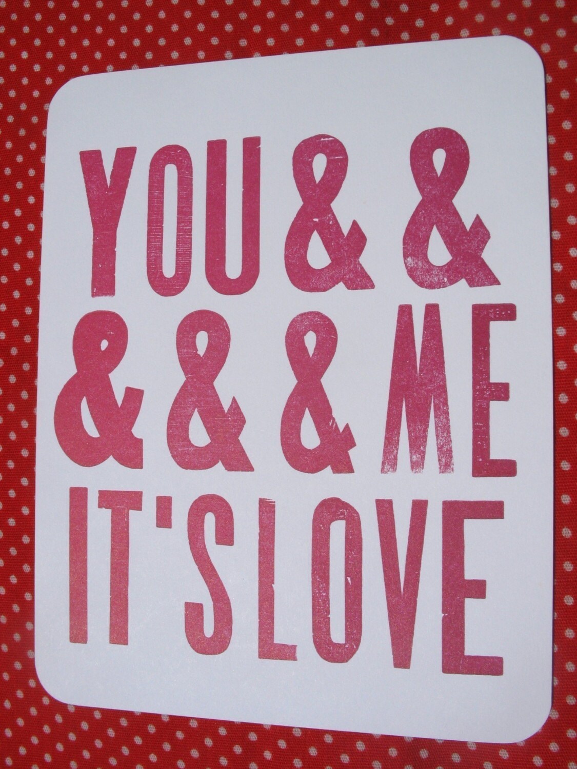
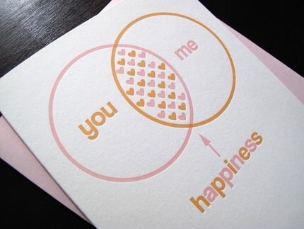
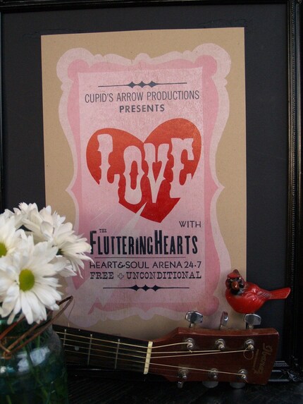
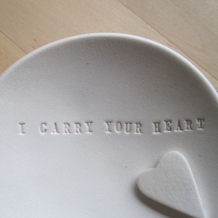
in honor of valentine's day, we at her long way home would like to share our typography obsession with you all by way of valentine and love inspired typography.

the you and me its love postcard from rarrarpress is one of our favorites:


anemone letterpress' venn valentine has got us all smitten between the color choice and sweetness of the sentiment, we're right in that happiness zone with them


for a year round, permanent installation of valentine-love-typographic-perfection, we are drooling over roll and tumble letterpress's gigi love handprinted poster


and of course, what would valentine's day be without the heart breaking perfection from paloma's nest? especially when it's the title of our favorite poem?


Tuesday, January 12, 2010

new feature: typography tuesday


we are bonafied typography junkies here at the long way home. so we thought what better way to celebrate simply gorgeous letters that you want to eat with a spoon, than a weekly feature?

from gorgeous fonts, to letterpress, to designs-we-wish-we-thought-of, every tuesday will be: TYPOGRAPHY TUESDAY.


you can either blame or thank joanna swanson (swedish-american art director/stylist/blogger extraordinaire) of simpleblueprint not only for our new feature but also for the images in today's post.

the 7 rules to understanding design and designers prompted the commitment to our weekly feature (as did the lovely alliteration of typography tuesdays....though we suppose we could have chosen typography thursday for the same effect). we are loving not only the wittiness of this image, but also the layout and font use, and of course design.

1. designers are meant to be loved not to be understood 2. the purpose of design is to make the ordinary extraordinary 3. the best designers are the ones who find the good clients 4. design must seduce, shape & more importantly evoke an emotional response 5. good design can be planned but great design just happens 6. design the right things design the things right 7. imagination is more important than knowledge.


and we couldn't agree more.


also featured on joanna's blog was the cover of the australian financial review magazine:


there are so many reasons we are obsessing, lusting, drooling, and falling-in-love with this magazine cover. first and foremost, and we mean no offense by saying this, but the topic implied by the title of the magazine - australian financial review magazine - simply brings a tear to our eye- but not the good kind (the kind that generally results from sheer bordem).
HOWEVER, if they are trying to sell their magazine purely based on the cover, well then we can gurantee that we would purchase this magazine.

from the layout, to the font use, to the border use, to the bleeding of the colors, we are in love-love-love with it. it truly doesn't get much better than this.

the cover could be in a completely different language (well, it kind of is) and we would still find ourselves head over heels.


what say you, my lovelies?